Our Process Overview
What we did
- Brand identity from scratch
- Logo design
- Typography and color system
- Motion and photography style
- Custom iconography
- Infralytics demo release video
Overview
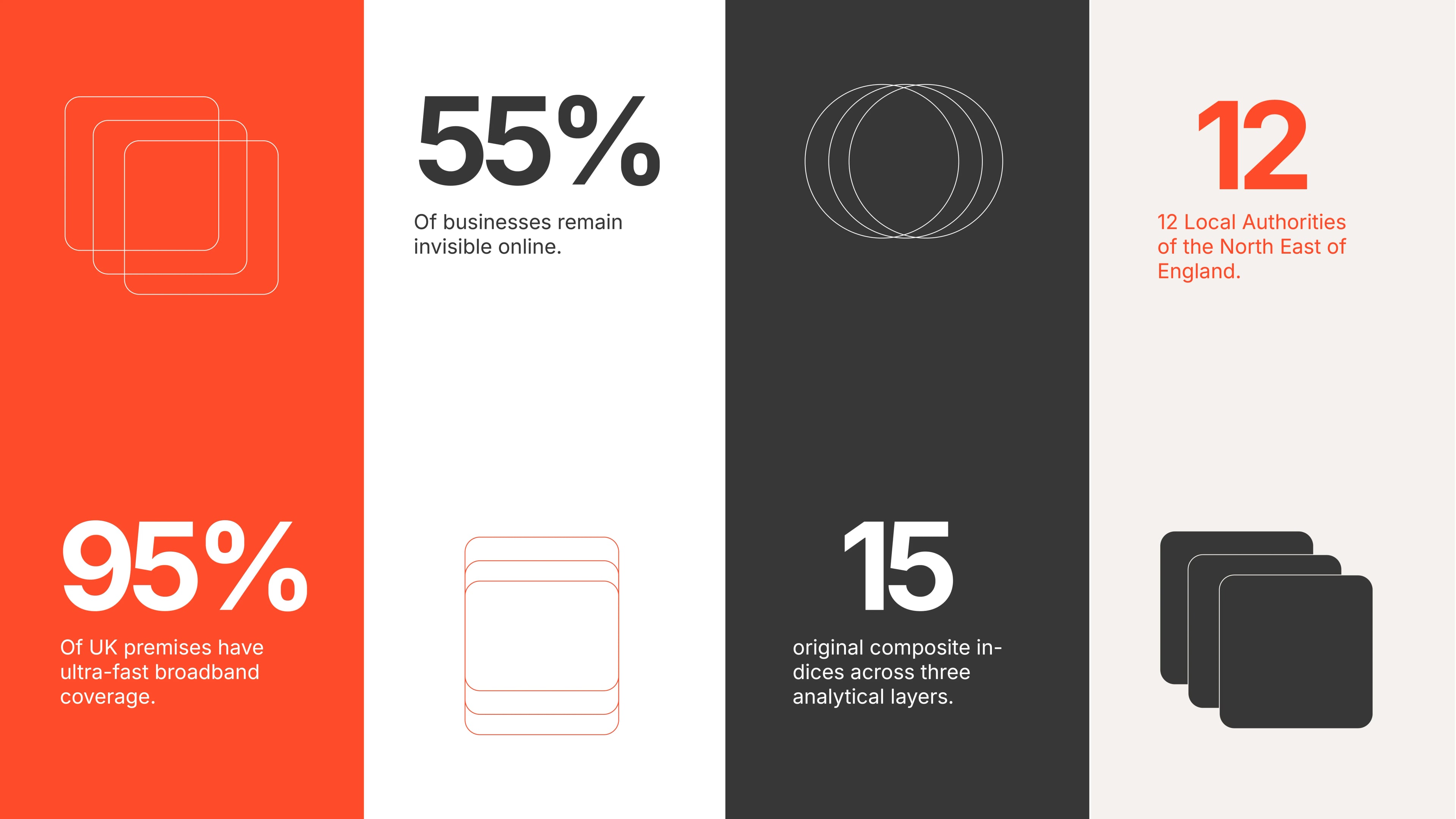
95% of UK premises have ultra-fast broadband. 55% of businesses remain invisible online. The problem isn't coverage. It's participation, and no one was measuring it.
The platform to solve that Infralytics-GIIS and Adoptic was built and ready. What was missing was a brand capable of communicating that intelligence to the people who control planning budgets, infrastructure investment, and local authority mandates.
We built the brand's identity from zero.
Brand Positioning: The infrastructure data exists. The visibility does not.01
Most infrastructure decisions in the UK are made on incomplete information. Coverage maps show what operators claim. They do not show what is genuinely available at the address level, where resilience risks are concentrated, or which communities are being left behind while the numbers look healthy on paper.
A local authority can report 92% gigabit availability while full fibre deployment density sits at 33%. A regional average can hide postcodes where coverage drops to 54.9%. Standard tools do not surface these anomalies. Decisions get made on those numbers. Real people are affected by those decisions.
Nexintell was founded to close that gap. Their platform, Infralytics-GIIS, transforms fragmented public data including Ofcom connectivity records, ISP claims, regulatory datasets, and population layers into structured, explainable intelligence. Not just where assets exist, but how infrastructure layers depend on each other, where the gaps live, and which investments will create the greatest long-term impact for real communities.
Infrastructure without adoption is incomplete. Nexintell measures both.
The platform was proven. The North East England pilot covered 12 local authorities and 72,168 Ofcom postcodes, surfacing anomalies no existing tool had caught. What was missing was a brand capable of walking into a room with planners, regulators, and investment committees and being taken seriously from the first slide. We built it from scratch.
Visual Identity Components: Every component designed to carry institutional weight. 02
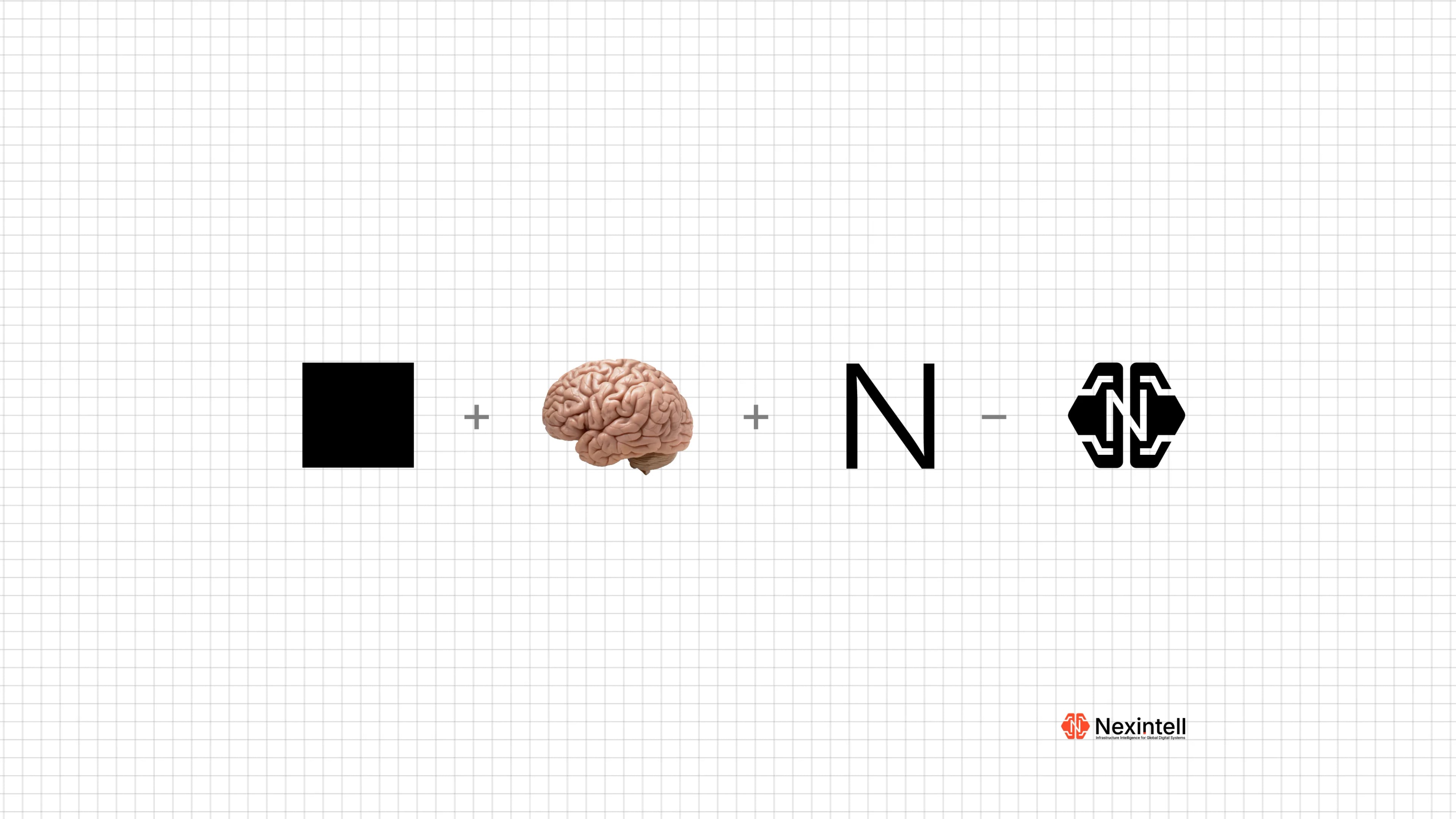
The founder came with a clear creative direction: a distinct shade of orange as the primary brand color, paired with the idea of a brain to symbolize intelligence. That single decision became the foundation of the entire identity. From there, our role was to build a complete visual system around it, one strong enough to stand confidently before the highly critical audiences Nexintell would encounter.
On its own, orange risks reading as energetic but lightweight. The wrong tone for a platform making serious claims about infrastructure governance. We solved this by grounding it against a deep near-black foundation. In that context the orange shifts register entirely. It stops reading as enthusiasm and starts reading as a live signal on a system that is actively running. Precise. Analytical. Authoritative.
The logo mark was designed to reflect the two-dimensional logic at the core of the platform: infrastructure and consequence as distinct but inseparable layers. The geometry is deliberate. Every proportion communicates something about how Nexintell processes intelligence. The typography system was chosen for its geometric clarity and ability to hold density without losing legibility, whether inside a data-heavy dashboard or a one-page investor brief.
Custom iconography was developed from the ground up because no existing library had the vocabulary Nexintell needed. Composite indices. Consequence layers. Postcode-level network mapping. These concepts required a new visual language built on the same geometric logic as the broader identity system.
Visual and Messaging: Putting the brand to work in the real product.03
A brand identity is only as strong as how it performs when applied. This phase was about taking every component and placing it inside the contexts where Nexintell actually operates: the product interface, the AI intelligence layer, and the communication materials that reach decision-makers.
One of the most compelling applications was designing around Nexintell's AI prompt functionality. We visualised the experience of a planner or investor typing a plain-language question into the platform and receiving structured, source-cited intelligence in response. Not a generic chatbot interaction. A demonstration that this platform thinks and explains — turning a question about fibre deployment density or resilience risk into an actionable, evidence-backed answer in seconds.
The messaging direction followed the same principle as the visual system: direct, evidence-led, and built for an audience that does not have time for vague claims. The brand voice positions Nexintell not as a data aggregator but as an intelligence platform. The distinction matters to the people they are trying to reach, and the language reflects it at every touchpoint.
Demo Release Video: Show the product working. Not what you wish it could do.04
Most technology companies explain their products with static graphics, stock imagery, or AI-generated visuals. The audience has seen all of it. None of it closes deals because none of it proves anything.
When Nexintell was ready to launch Infralytics, we took a different approach. The demo release video shows the platform as it actually works. Real dashboard walkthroughs. Live data visualisations surfacing composite indices, fibre rollout progress, and resilience scoring in motion. Map visualisations showing postcode-level network intelligence across the North East of England, making the gap between reported coverage and real participation visible on screen.
When Nexintell was ready to launch Infralytics, we took a different approach. The demo release video shows the platform as it actually works. Real dashboard walkthroughs. Live data visualisations surfacing composite indices, fibre rollout progress, and resilience scoring in motion. Map visualisations showing postcode-level network intelligence across the North East of England, making the gap between reported coverage and real participation visible on screen.
The statistics do the heavy lifting: a local authority reporting 92% gigabit availability while full fibre deployment density sits at 33%. A regional average masking postcodes where coverage drops to 54.9%. These are not marketing claims. They are the problem the platform was built to solve, shown in real data, in real time.
The video was designed with the decision-maker's attention in mind. Engaging motion design and purposeful background music create a viewing experience that holds attention from the first second and builds a case that is impossible to dismiss. Not a product tour. A proof of value.
If your product genuinely solves a real problem, the most powerful thing you can do is show it working.