Our Process Overview
What we did
- Logo refinement
- Grid and pattern system
- Structural balancing
- Motion identity logic
- Colour system expansion
- Visual identity applications
Overview
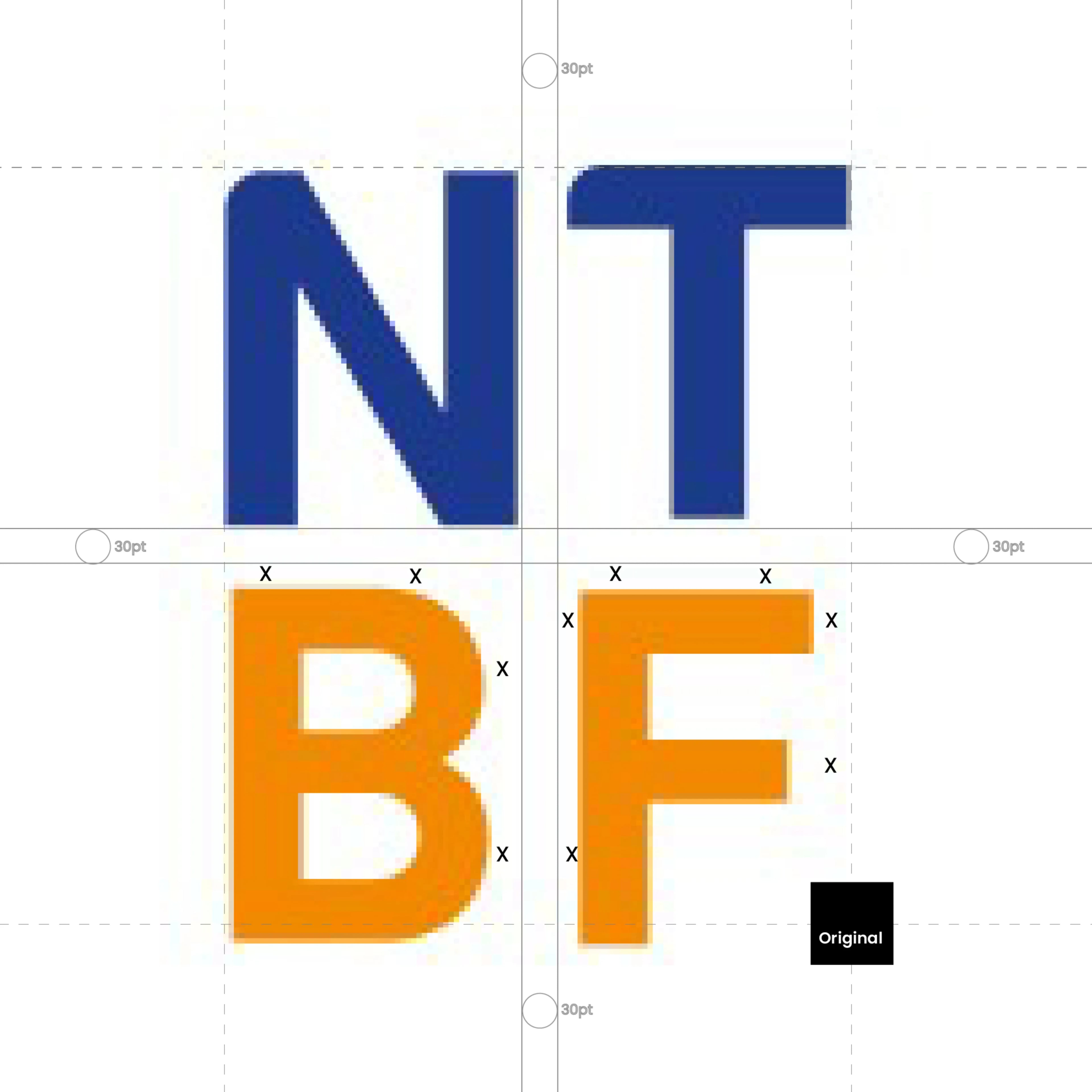
The NTBF identity already carried a strong visual foundation: four letterforms arranged within a square composition, naturally forming a structured grid system central to the brand’s recognition. The objective was not redesign. The goal was refinement. The original mark contained inconsistencies in scale and proportional weight across the four characters (N, T, B, F). While subtle, these differences disrupted the visual balance of the identity and limited the logo’s ability to function as a broader brand system. The refinement focused on preserving the existing visual language while improving its structural integrity.s
Logo Refinement: Improving structural equity across the mark01
The original NTBF logo arranged the four letters within a square composition. However, variations in letter sizing and visual weight created imbalance across the layout.
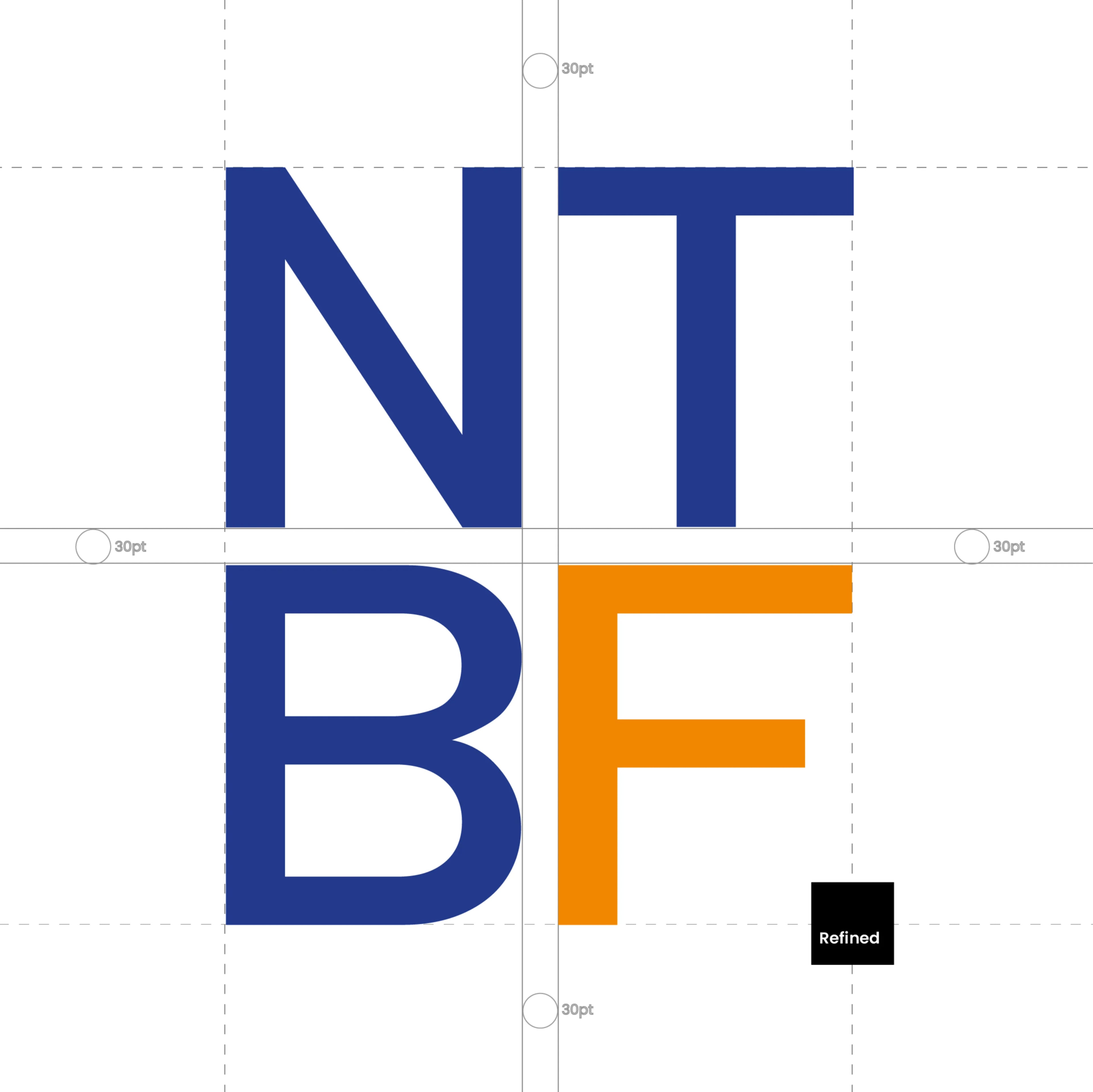
Rather than altering the concept itself, each letter was individually refined through controlled adjustments in scale, curve alignment, spacing, and visual distribution.
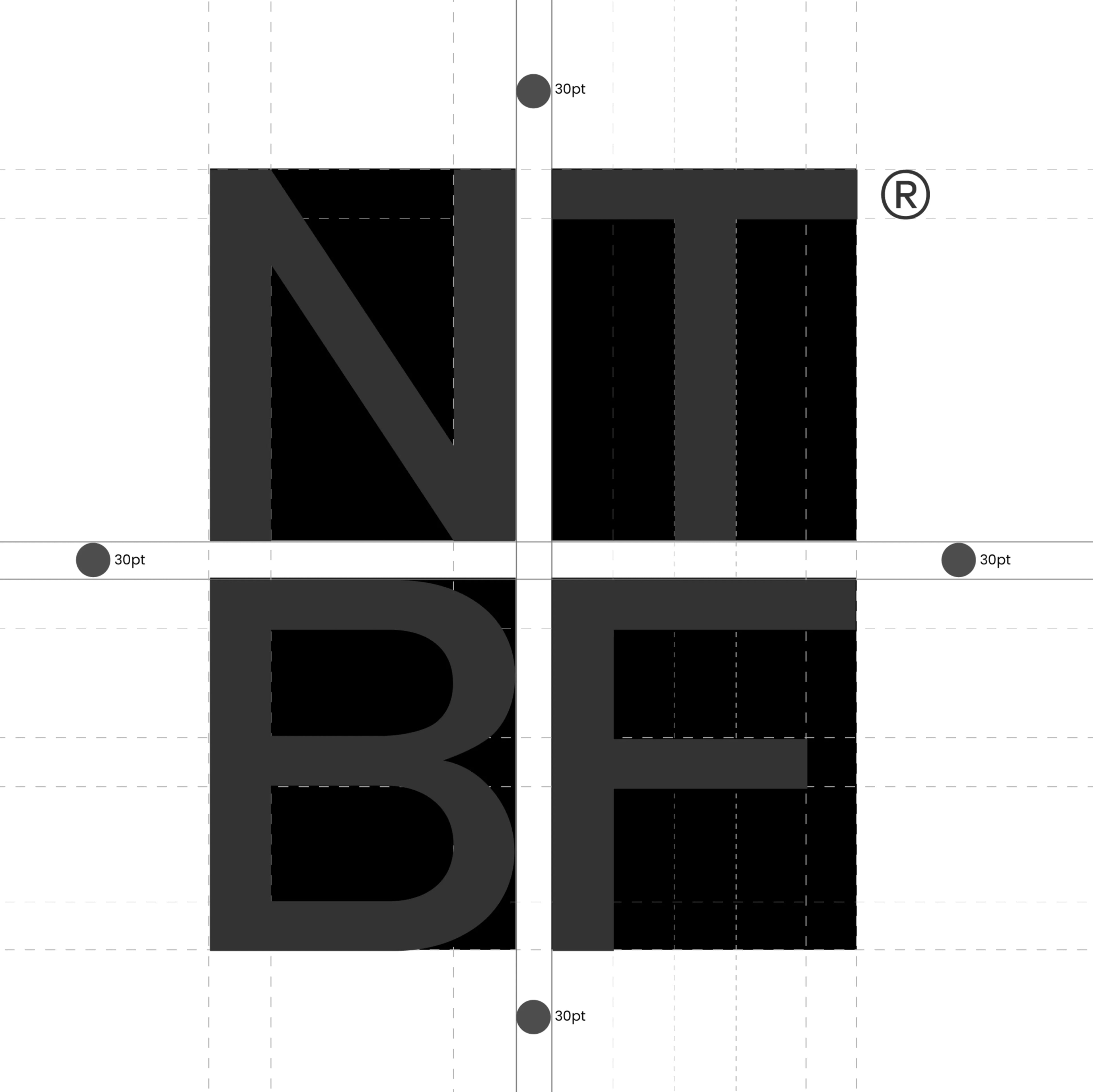
The result is a unified structure where every character occupies an equal square unit.
The refined identity resolves into a precise 2×2 grid system: One letter. One square. Equal distribution.
This creates stronger symmetry while preserving the original brand recognition.
Building the Pattern System: Turning structure into a brand asset02
The refinement process revealed something beyond the logo itself.
The square arrangement naturally formed a repeatable visual system.
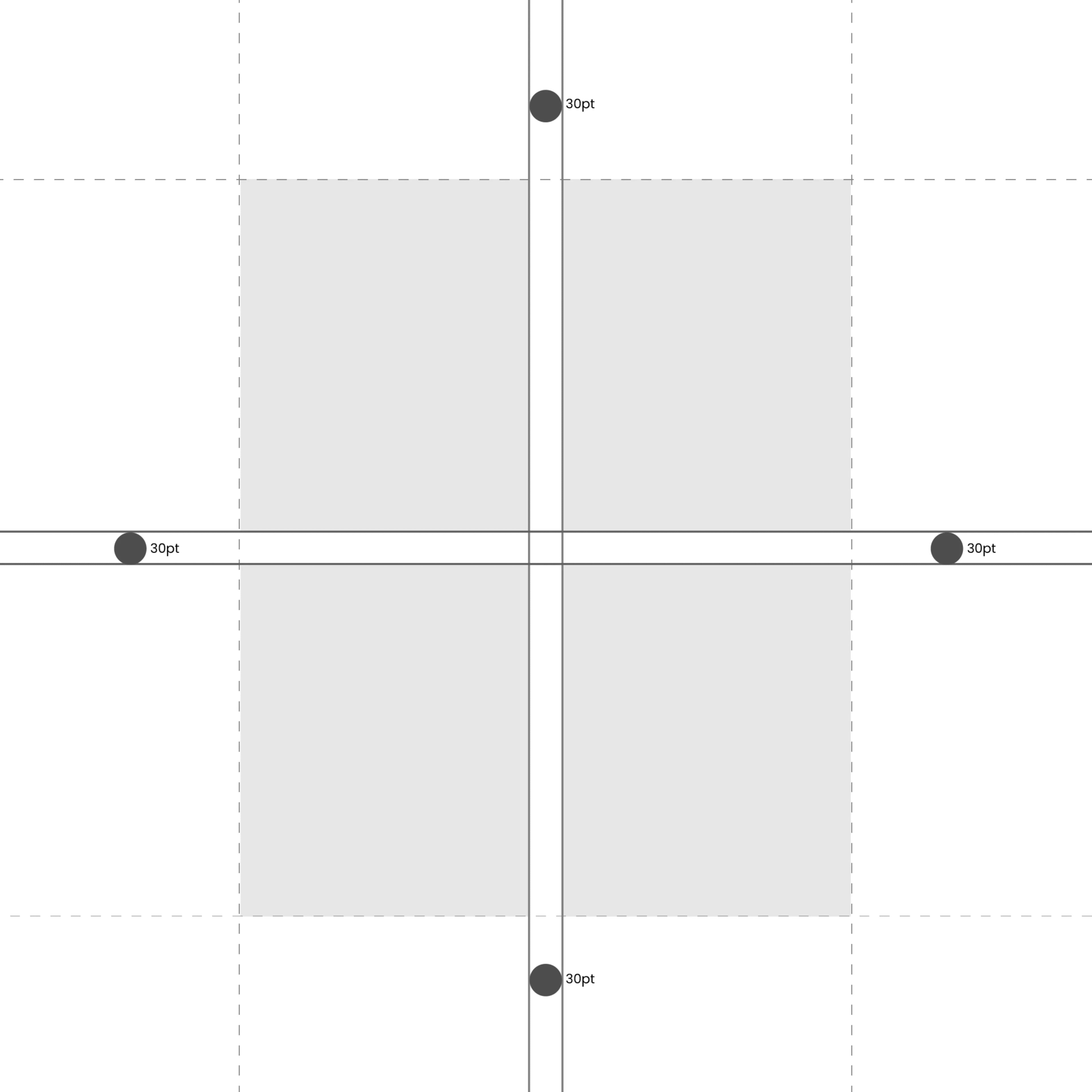
Each letter now occupies a perfectly balanced unit, creating a four-square grid that functions as the foundation for an expandable brand language.
The pattern is constructed from equal units with consistent spacing relationships and proportional logic.
Dot guides define structural anchors across the composition, establishing the internal architecture behind the system.
At this stage the pattern exists in its neutral form — the scaffold from which future brand expressions emerge.
Pattern → Logo Relationship: One system. Two functions.03
The same structure used to create the pattern also generates the logo.
The four-square arrangement resolves directly into the NTBF mark, with each letter seated precisely inside its unit.
This relationship allows the identity to move fluidly between abstract pattern and logo expression.
The result creates opportunities for: Pattern-to-logo transitions, Logo reveals and exits, Motion morph systems, Digital and social animations, Print and environmental applications.
Rather than existing as separate assets, the logo and pattern become parts of one visual language.
Identity Expansion: Extending the visual range 04
The existing primary brand colours were retained to preserve recognition and continuity.
Two complementary colours were introduced to expand flexibility across digital applications.
The extended palette improves: Visual hierarchy, Text legibility, Social content visibility, Thumbnail performance, Banner applications, Multi-format digital usage
The expansion increases usability while remaining visually aligned with the established identity.
Putting It All Together: Outcome05
The NTBF refinement preserved the original identity while improving its structural precision and extending its usefulness beyond the logo itself.
What began as a logo balancing exercise evolved into a scalable visual system built on a simple principle: Four letters. Four squares. One unified brand language.